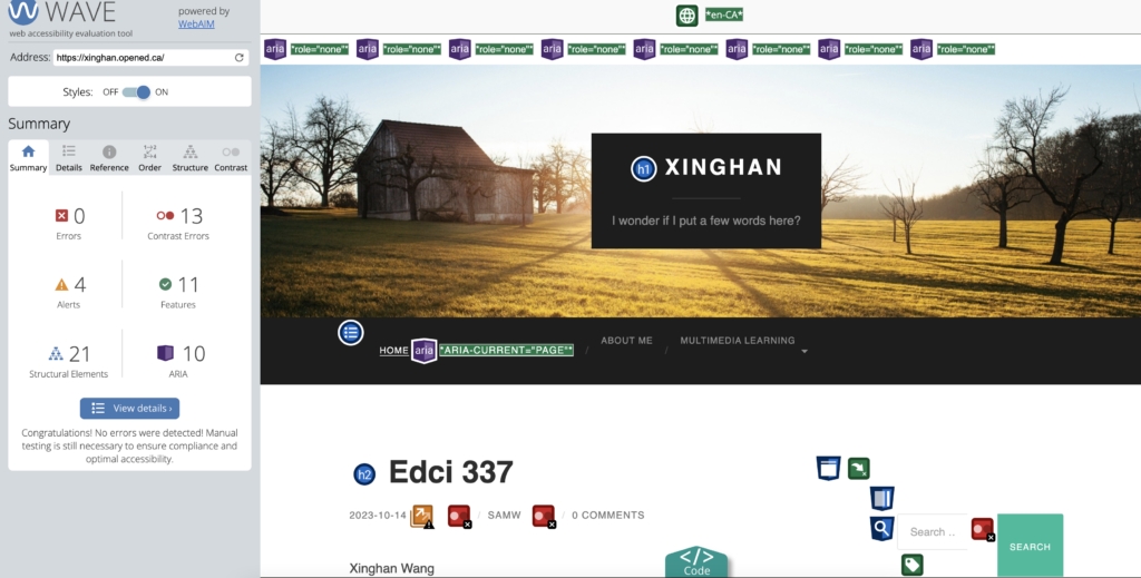
This is screen Shot of my wave report


After going through the report of my first blog, I discovered that there were still many contrast errors in my first assignment. For instance, there were some issues with things like photos and text layout, and I shouldn’t have put my name below the blog. I think this report is very helpful because it can help with my future blog posts and improve their look.
Have you used Text to Speech tools before? Did you find it useful? Did you try out some of the different voices? What impact did the different voices have on your ability to absorb information?
I frequently use text-to-speech tools. As a student majoring in the humanities, I have to deal with lengthy reading materials. Reading everything can be waste lot of time, especially for non-native English speakers. Personally, I find that listening is easier for me to understand than reading. I believe text-to-speech tools are very convenient and well-suited for university life
Graphic design is inherently visual – what additions or modifications could you make to ensure that learners with visual impairments have access to the same information in an infographic in an online setting?
I believe that graphic design is not very friendly for people with visual impairments. However, this is where text-to-speech tools come into play. They can add an audio feature next to articles, allowing visually impaired individuals to experience the world within the text. While there are many visual elements they cannot perceive, at least it can help them understand the content and make them aware that they are not excluded or treated as ‘special’
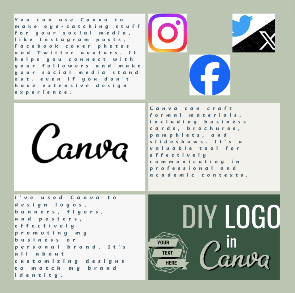
In summary, when creating my infographic using Canva, I paid attention to several key design principles such as alignment, hierarchy, contrast, and balance. These principles helped me ensure that my infographic was both clear and visually engaging. I also made sure to incorporate white space and maintain a limited color scheme for a cohesive look. I emphasized the importance of customizing them to suit my content and preserving a simple and clean design.
Leave a Reply
You must be logged in to post a comment.